Paint Your Home the Colors of Downton Abbey
Inspired by Downton Abbey, a new collection from Kelly-Moore Paints will now enable fans to live among the dusty grays and muted pastels they have loved seeing in the hit series. “We were getting inquiries from people trying to locate particular paint colors they’d seen on Downton Abbey,” says Mary Lawlor, manager of color marketing for Kelly-Moore Paints. “That gave us the idea to develop colors inspired by the amazing settings portrayed on the show.”
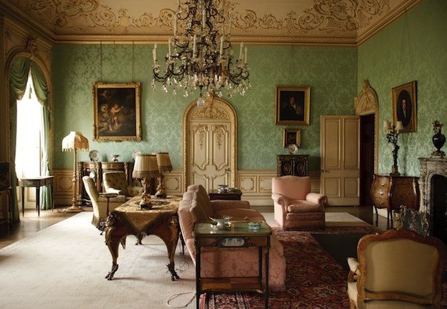
With a great deal of historical research and some help from Downton devotees on the Kelly-Moore staff, the company has created 19 hues, each one capturing an element of the glamour and grandeur of the show’s backdrop, an enormous and opulent estate in the English countryside. Some colors take their cue from the drawing room, where the aqua-green walls are softened by details of rose, ivory, and gold. Meanwhile, other colors reference the masculine, sophisticated oxblood and carnelian reds of the library. Several of the characters’ bedrooms, not to mention the servants’ kitchen, sparked additional shades.

In the eyes of today’s viewer, the colors in Downton Abbey evoke a bygone era. But in their time, these hues were in fact quite modern. “By the early 1900s, the dark, opulent look of the Victorian interior that had prevailed for decades was beginning to feel oppressive,” says Allison Kyle Leopold, a journalism professor at the Fashion Institute of Technology in New York City and the author of numerous books on historic design. “The new century would be all about lightening up and simplifying, and a cleaner palette of bright colors and pale hues was a big part of that.”
For Mary Lawlor and others responsible for the Kelly-Moore Paints product line, it was no mean feat to develop new colors based on historical examples. The challenge was to come up with solutions that, even as they remained true to the Edwardian Era, also managed to fit seamlessly into 21st-century homes. Well, it may not have been easy, but Kelly-Moore did it.
Take, for instance, Jitterbug (HLS4211). This ethereal blue would look as welcoming in a contemporary bedroom as it does in Lady Grantham’s. Likewise, Rapier Silver (KMW65) calls to mind the utilitarian kitchen on the show, but it echoes the grays that are currently so popular in interior design. “Although these colors are rooted in the past,” Lawlor points out, “they are thoroughly usable in today’s homes.”
On January 5, the fourth season premiers on PBS’s “Masterpiece.” If you haven’t yet watched the show, consider this: The fans of Downton Abbey are so devoted that many are apparently seeking to re-create the look of its interiors in their own homes. So there must be something to this early-20th-century period drama, right?
In the eyes of today’s viewer, the colors in Downton Abbey evoke a bygone era. But in their time, these hues were in fact quite modern. “By the early 1900s, the dark, opulent look of the Victorian interior that had prevailed for decades was beginning to feel oppressive,” says Allison Kyle Leopold, a journalism professor at the Fashion Institute of Technology in New York City and the author of numerous books on historic design. “The new century would be all about lightening up and simplifying, and a cleaner palette of bright colors and pale hues was a big part of that.”
